‘Tis the Season for Seed Catalogs

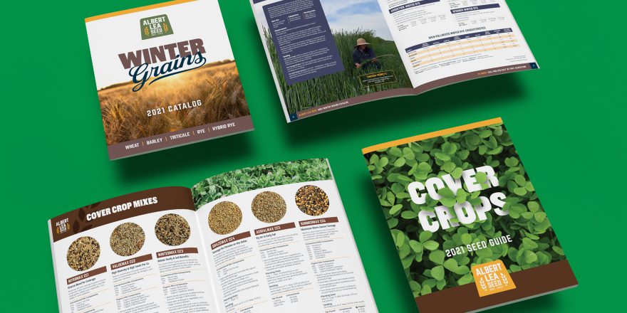
Albert Lea Seed needed some new attention-getting catalogs to help promote their lines of Winter Grains and Cover Crops. That’s where we stepped in. First, we mentally stepped into the minds of growers and farmers. This required boots, which, in our minds, are always easy to find in our sizes. Next, we stepped into a field of green, one foot in front of the other, noticing the clover making its way around each step. Ah-ha! We found our vantage point for the Cover Crops cover! Or is it covered cover crops?

Okay, okay, it doesn’t always happen that way. We can’t always direct the way our imaginations work, but one thing we know for sure is we always navigate our way to creative solutions. These catalog designs were no exception. Beautiful photography and graphic design, combined with concise and easy-to-find data make other brochures look like weeds. And just like weeds don’t lead to higher crop yields, mediocre marketing materials won’t lead to higher sales.

Albert Lea Seed’s marketing and branding materials needed to match the same level of quality as their products and services. They have some of the highest quality, purest seeds available, and we’re happy to help plant that information into the minds of current and prospective customers. No micro-chips, just good design, good branding, and good marketing. Good day!

We’d love to talk about your brand’s potential. Reach out today! We’ve got you covered.

Design-to-Promote IOGA’s Bike-to-Farm Tour Event

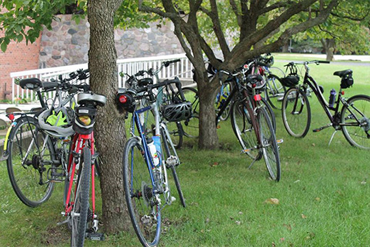
We recently teamed up with the Illinois Organic Growers Association (IOGA) to help brand and visually promote their bike-to-farm tour event in Champaign County, Illinois earlier this month. Participants rode bicycles along the beautiful countryside, through seven organic farms to enjoy fresh food and to meet the farmers who provide it.

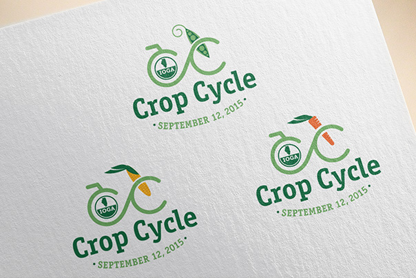
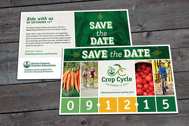
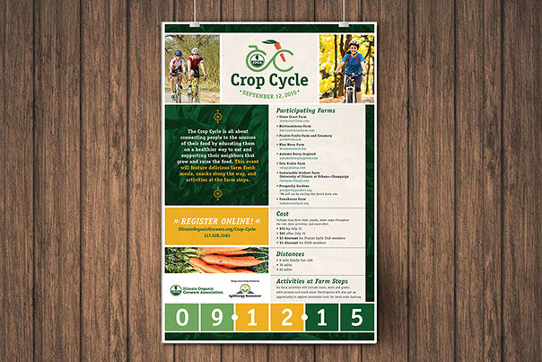
Our promotional involvement started with naming the event “Crop Cycle” and continued by developing a three-part logo set. Once in place we integrated the branding into the designs for direct mail, posters, and rider cue sheets.

We’re happy to have been involved with a great event promoting great food, farms, and self-powered transportation. Read more about the bike-to-farm tour on the IOGA website.CC_Logos CC_PostCards CC_Poster CC_Bikes

The B.E.S.T. agency for the job

St. Louis-based financial planning company B.E.S.T. Wealth Management recently hired Anda Creative to help them rebrand.

Client consultation, brand assessment, and market research determined that the client’s biggest struggle was to appeal to the three very different target markets they represent: Individuals, Families, and Small Business Owners. The client also wanted to find a way to appeal to the younger, more tech-savvy segments in each of these markets.

After establishing a brand position and strategy, we began development on a new logo. In order to represent the three markets, we gave each their own color scheme. A color from each scheme was brought into the logo to compliment dark blue, which was used as the primary color for B.E.S.T.

These colors were carried throughout website, making each of the three markets easily definable. The user simply follows their market from the home page to enter a site within the site that caters to their specific needs. The site is a custom developed theme on a WordPress CMS, fully responsive for mobile and tablet, and just so happened to win an award for Best Website Design.

In addition to the brand position, logo, and website, we worked with B.E.S.T. to develop and design a direct mail campaign targeted to the small business owner market.

See the website and direct mail campaign for  B.E.S.T. Wealth Management by clicking this link.

BEST_screenshot