Green Tree Woodworks — From Outdoors to Online

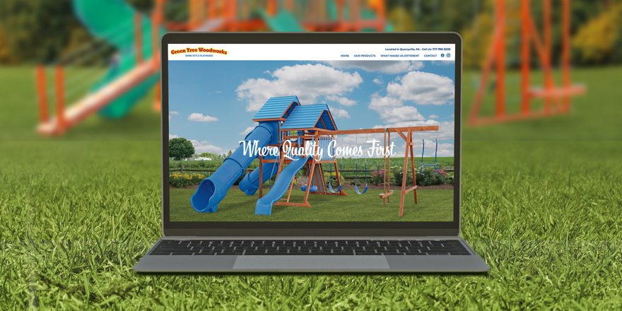
For the past few months, the Back Forty Creative team has had the opportunity to work with a new client, Green Tree Woodworks.

Green Tree Woodworks is a leading manufacturer of outdoor, wooden swing sets and playsets. With over 25 years of experience, they pride themselves on their high-quality construction and their wide variety of builds.

To better showcase their quality products and services, Green Tree Woodworks decided to move from outdoors to online with a new website design. The site implements a user-friendly interface, making finding product information quick and easy. It also features a blog to supply their customers with helpful information while boosting their search engine optimization (SEO).

We also created Facebook and Instagram pages to help grow their business online. Each month, we work with them to develop a social media strategy to best engage their online audience. We create customized content and schedule paid Facebook and Instagram promotions to reach new and existing clients across their targeted demographic.

Prior to working on their new website and social media pages, we also updated their logo and brand identity to better showcase who they are as a brand.

Overall, we are happy because our client is happy! Green Tree Woodworks owner, Steve. S. recently shared:

 “I am very happy with the results I have been getting with Back Forty Creative. They have taken my business to a new level. Customers have more ways of getting a hold of us and do not have to look hard to find us. I am also very happy with the service and the people I work with.”

 Is your business in need of a new website? Or perhaps you just want to start out on social media? Either way, Back Forty Creative can help! From strategy to responsive design and development to search engine optimization (SEO) — we do it all!

Contact us today for a free consultation and learn more about our web and digital services or social media services today!

What Makes a Good Website?

Today, a website is one of the most important forms of communication a business can implement. In fact, nearly two-thirds of small businesses rely on websites to connect with customers.1 However, a bad website is like a cranky salesperson who hasn’t had their caffeine yet.

Would you want to deal with that?

Assuming your answer is no, we agree! In today’s ever-growing online world, it’s not just about having a website, but having a good website (and in our preference, a really, really good website).

But what makes a website good? Great question, because it has an easy answer. A good website achieves its goals. The real art to website development is in how you get from a blank page to a strategically thought-out website designed to realize those goals. Any successful web project is going to go through pretty much the same process, but we like to start off by finding answers to the following questions.

Why do you want a website?

Who is your target audience?

What do you want from that audience?

How much are you willing to invest to get your audience to do the thing you want them to do?

The better answers we can get to these questions, the better the end product will be. From there, designers and developers take that information, run with it, and construct an experience tailored to achieve the identified goals.

How do we do that? It really depends on what the goals are, but usually we’ll keep the following ideas in mind.

User Experience

A good website should be easy to use. In almost every case, you are asking your visitors to do something. It might be to buy a product, visit your store, or engage with your content, but in every case, it’s the job of a high-quality website to make that engagement as easy as possible. Your site should be understandable to the user, even at a glance; this usually falls into place once a clear navigation is developed and calls to actions are placed throughout the site. Your customers won’t spend time hunting around for the things they need. If good user experience is not considered, often times, the user will simply move on to the next site in their search results that can better help them achieve their end goal.

Appealing Design

A good website should be attractive and professional looking. Have you ever judged a book by its cover? Same thing applies here.

A well-considered, tailored design communicates confidence to the user and heightens a brand’s credibility. If you were to put two websites with similar content next to each other, the better-looking site will grab the conversion every time. Even if the products on the less attractive site are of higher quality, the more professional looking site will be more successful simply due to user indifference. They don’t know what makes your product better than the competition—you have to tell them, and in most cases, you don’t have much time to convey this. This is what good design does. It helps make your case to the user about why your product or service is worth your audiences’ time. Often, web design is about projecting clarity. This is who we are, this is what we do, this is why you should care about it.

Search Engine Optimization (SEO)

SEO must also be considered in well thought-out websites. SEO allows a website owner to understand how consumers are searching and finding information about their own brand and their competitors online. Good websites incorporate SEO practices to help increase visibility, visits, and rankings. Fresh and engaging content also helps with this. Updating your site with featured news, a weekly blog, or connecting social media channels can also help enhance your SEO efforts.

Efficient Development

Last, but definitely not least, a website needs to work correctly. That seems obvious, but you would be surprised how often this gets overlooked. This is the part where attention to detail matters. Does the site load well on mobile, even when you are out in the field? Do all of the buttons work well on your device? Is the information clean, clear and understandable? Every detail is important. Good websites do this well.

No matter what, in the end, everything comes back to the same concept. Good websites achieve their goals.

Are you looking for a good website? We would love to assist you in growing your brand. To help simplify the process, we have a variety of web design and development packages to choose from, but also offer customization if you’re looking for something fantastically unique. So, give us a call today! (This is a call to action — something else all good websites need to have.)

Sources

https://espresso.digital/small-business-website-statistics/

Wrapping Up 2019 with a Winning Website!

The Back Forty Design team is very excited to announce that our recent e-commerce website design and development project for our client Albert Lea Seed did ex-SEED-ingly well in two recent awards programs — the 2019 .dotCOMM Awards and the W3 Awards!

Award Winner: Albert Lea Seed Website

Albert Lea Seed launched in 1923 as a family-owned seed store offering field seed and garden seed. Now three generations strong, they offer knowledge and experience in seed and crop production, processing, and cultural practices that benefit any sized farm operation. They also provide organic conventional non-GMO farmers with seed for corn, soybeans, pasture & forage, small grains, and cover crops.

As their product line continually expands in size and scale, Albert Lea Seed came to Back Forty Creative to develop and design a custom e-commerce website where consumers can easily shop their wide range of quality products online.

For consumers who would rather purchase Albert Lea Seed products in person, we included an interactive map where individuals can search for dealers in their area by address, distance, or state with just a click of a button.

Since their product lineup includes a wide-range of products, it was important to create an easy to navigate website that cleanly displayed each product’s set of information and trial data. Since this site also serves as a hub of information for their consumers, further demonstrating Albert Lea Seed’s long lineage of expertise, it was important that this was also considered.

Want to know more? Explore the site yourself! Visit alseed.com.

Interested in learning more about our branding services, packaging and print design, web and digital design, and everything else related to responsible design for sustainable agriculture, food, and lifestyle businesses? Make sure to check back for updates or follow us on Facebook and Instagram.

GDUSA June 2016 Issue Features Our Two
Web Design Awards

We’ll savor these summer awards in a bed of summer savory. The sweet, sweet smell of victory. In case it’s not clear, the GDUSA American Web Design Awards issue (featuring our two awards!) is now out on stands. Go grab/order yours!

GDUSA_WebAwards_Magazine_01_Blog

What’s All The Buzz About?
GD USA Web Design Award Award 2016

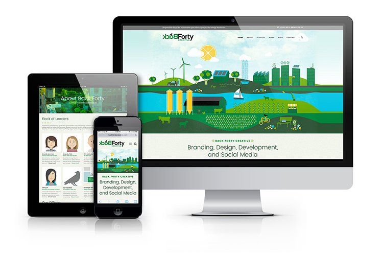
Back Forty Creative is pleased to announce our 2016 GD USA Web Design Award for our very own backfortycreative.com! Our site will be featured in the June edition of the publication.

BackForty_Website_Mockup

A2-Immune Leads the Whey to a Healthy Lifestyle

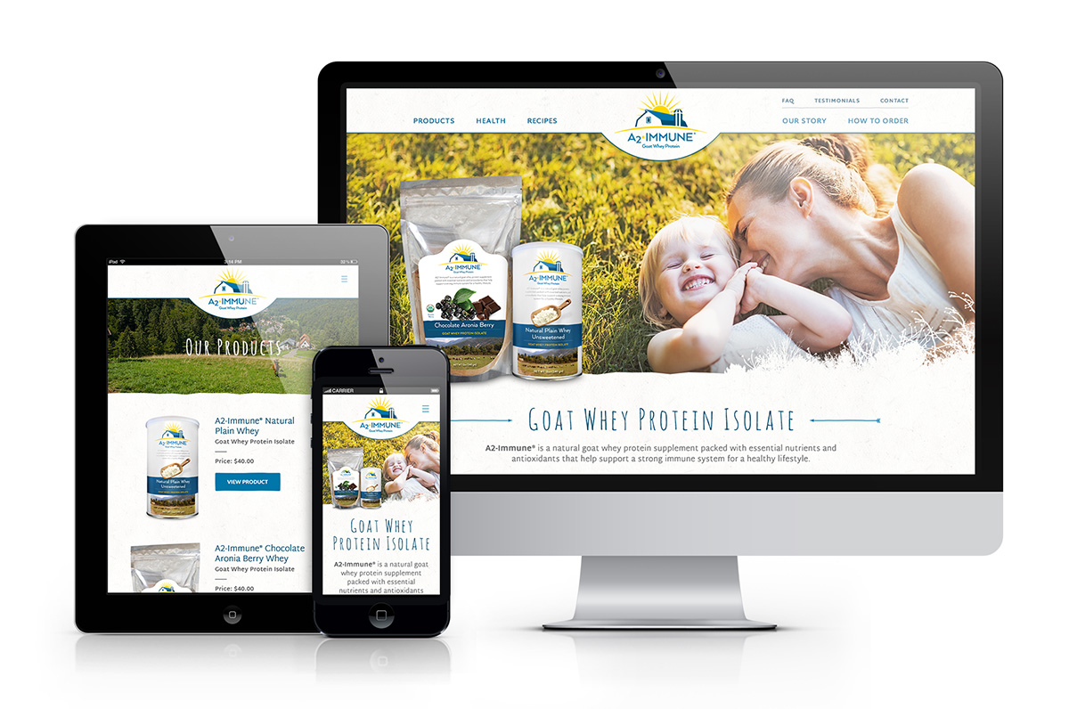
Back Forty Creative worked with Minnesota-based Point of Light to design the packaging for their line of goat whey protein, A2-ImmuneŸ. We also designed and developed a website for A2-Immune, showcasing the different flavors. The site implements a user-friendly interface, making finding product information and ordering quick and easy. To see samples of the packaging click here and to see the live site click here.

A2-Immune_Website_Mockup

The B.E.S.T. agency for the job

St. Louis-based financial planning company B.E.S.T. Wealth Management recently hired Anda Creative to help them rebrand.

Client consultation, brand assessment, and market research determined that the client’s biggest struggle was to appeal to the three very different target markets they represent: Individuals, Families, and Small Business Owners. The client also wanted to find a way to appeal to the younger, more tech-savvy segments in each of these markets.

After establishing a brand position and strategy, we began development on a new logo. In order to represent the three markets, we gave each their own color scheme. A color from each scheme was brought into the logo to compliment dark blue, which was used as the primary color for B.E.S.T.

These colors were carried throughout website, making each of the three markets easily definable. The user simply follows their market from the home page to enter a site within the site that caters to their specific needs. The site is a custom developed theme on a WordPress CMS, fully responsive for mobile and tablet, and just so happened to win an award for Best Website Design.

In addition to the brand position, logo, and website, we worked with B.E.S.T. to develop and design a direct mail campaign targeted to the small business owner market.

See the website and direct mail campaign for  B.E.S.T. Wealth Management by clicking this link.

BEST_screenshot