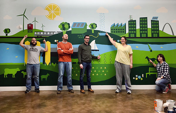
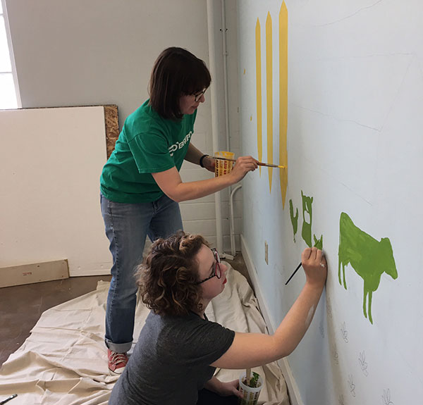
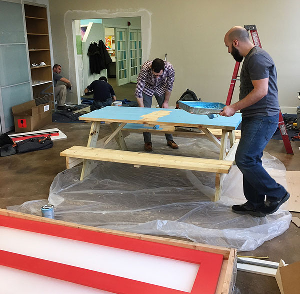
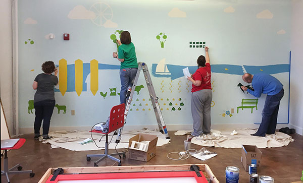
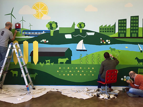
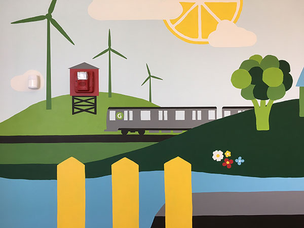
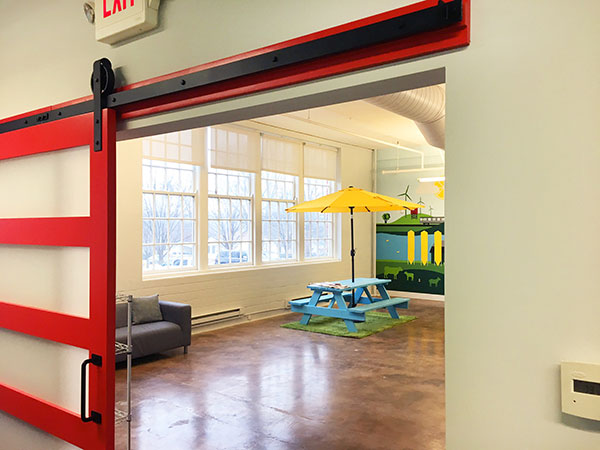
We recently expanded our office space and spent last week connecting the two units with a new barn door entrance, and painting a gigantic mural. It took 6 people (with lots of elbow grease) 4 days to complete the mural, but we finally wrapped it up last Friday night! Maybe we should have saved a bit of elbow grease for the door because it’s a little squeaky right now. We’ll deal with that later.
To read our post about the historical significance of our office building, which is on the National Register of Historic Places, please click here: http://www.andacreative.com/
ME Awards Show
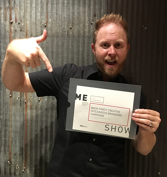
Aww yeah! Tim was on point at the ME Awards Show last night at the National Blues Museum…we won a BMA Marketing Excellence Award for our Back Forty Creative Integrated Branding Campaign! We’ve always felt integrated, but now it’s official and we couldn’t be more proud.
GDUSA June 2016 Issue Features Our TwoWeb Design Awards
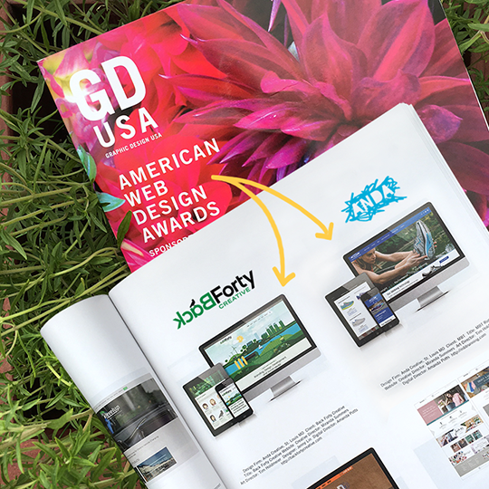
We’ll savor these summer awards in a bed of summer savory. The sweet, sweet smell of victory. In case it’s not clear, the GDUSA American Web Design Awards issue (featuring our two awards!) is now out on stands. Go grab/order yours!
What’s All The Buzz About?GD USA Web Design Award Award 2016
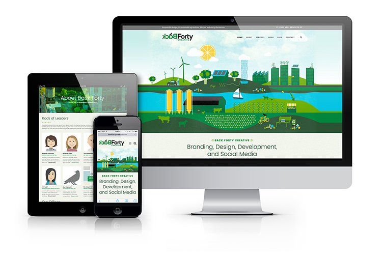
Back Forty Creative is pleased to announce our 2016 GD USA Web Design Award for our very own backfortycreative.com! Our site will be featured in the June edition of the publication.
A2-Immune Leads the Whey to a Healthy Lifestyle
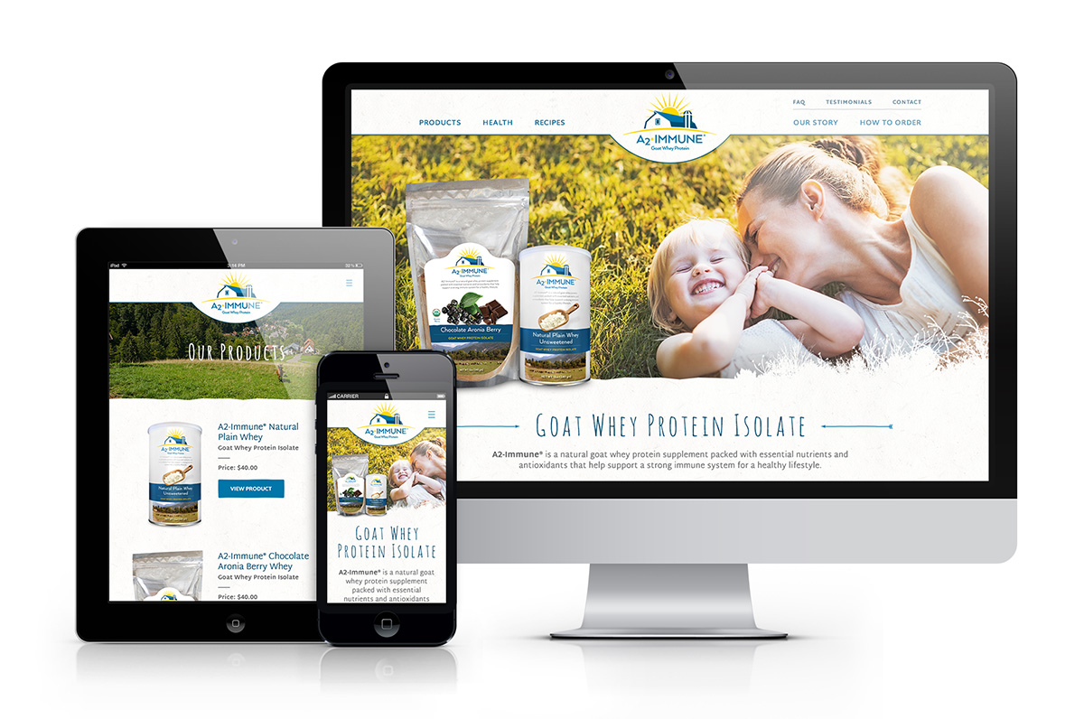
Back Forty Creative worked with Minnesota-based Point of Light to design the packaging for their line of goat whey protein, A2-Immune®. We also designed and developed a website for A2-Immune, showcasing the different flavors. The site implements a user-friendly interface, making finding product information and ordering quick and easy. To see samples of the packaging click here and to see the live site click here.
Winter Colors – Adobe Style!
Winter is here, bringing with it color palettes that are cool and refreshing. We have created four color schemes for the season using Adobe Color CC.
Analogous:
Monochromatic:
Triad:
Complementary:
Autumn Colors – Adobe Style!
Now that summer has ended, beautiful autumnal colors are all around! We have created four color schemes for the season by using Adobe Color CC. Feel free to apply them to your work, or just admire our palettes!
Analogous:
Monochromatic:
Triad:
Complementary:
Design-to-Promote IOGA’s Bike-to-Farm Tour Event
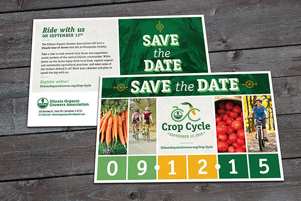
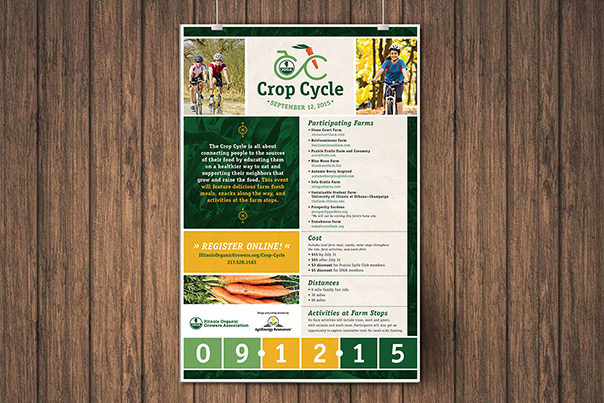
We recently teamed up with the Illinois Organic Growers Association (IOGA) to help brand and visually promote their bike-to-farm tour event in Champaign County, Illinois earlier this month. Participants rode bicycles along the beautiful countryside, through seven organic farms to enjoy fresh food and to meet the farmers who provide it.
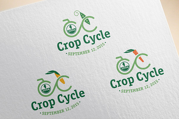
Our promotional involvement started with naming the event “Crop Cycle” and continued by developing a three-part logo set. Once in place we integrated the branding into the designs for direct mail, posters, and rider cue sheets.
We’re happy to have been involved with a great event promoting great food, farms, and self-powered transportation. Read more about the bike-to-farm tour on the IOGA website.
The B.E.S.T. agency for the job
St. Louis-based financial planning company B.E.S.T. Wealth Management recently hired Anda Creative to help them rebrand.
Client consultation, brand assessment, and market research determined that the client’s biggest struggle was to appeal to the three very different target markets they represent: Individuals, Families, and Small Business Owners. The client also wanted to find a way to appeal to the younger, more tech-savvy segments in each of these markets.
After establishing a brand position and strategy, we began development on a new logo. In order to represent the three markets, we gave each their own color scheme. A color from each scheme was brought into the logo to compliment dark blue, which was used as the primary color for B.E.S.T.
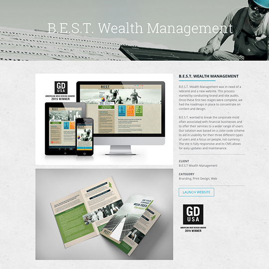
These colors were carried throughout website, making each of the three markets easily definable. The user simply follows their market from the home page to enter a site within the site that caters to their specific needs. The site is a custom developed theme on a WordPress CMS, fully responsive for mobile and tablet, and just so happened to win an award for Best Website Design.
In addition to the brand position, logo, and website, we worked with B.E.S.T. to develop and design a direct mail campaign targeted to the small business owner market.
See the website and direct mail campaign for B.E.S.T. Wealth Management by clicking this link.
GD USA American Web Design Award Winner
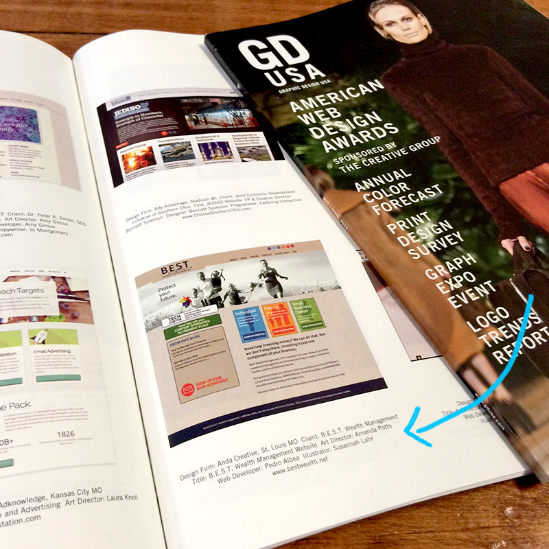
The July issue of Graphic Design USA (GD USA) is out on newsstands and features Anda Creative as a 2015 American Web Design Award winner. Our team designed and developed the site for B.E.S.T. Wealth Management, a St. Louis-based financial planning firm. B.E.S.T. wanted to break the corporate mold often associated with financial businesses and to offer their services to a wider range of users.
Read more about the design here and to see the live listing click here.